


There’s a Bull Market Somewhere
Weekly updates on the innovation economy and market commentary.

Introduction
Historically, there is usually a bull market somewhere that has a greater than 10% return in a calendar year. The difficulty exists in identifying which assets, industries, and companies are experiencing a bull market in a calendar year. Through a combination of charts and supporting commentary, today’s blog post discusses historical dispersions in performance returns across various sectors, stock market indices, and bonds.
Notes on Dispersion
Portfolios with higher volatility have a wider range of outcomes, implying potentially higher high points but lower low points.
If investors are subject to a risk constraint, then the investor can seek to maximize the utility function by attempting to maximize the return per unit of risk (as quantitatively measured by the Sharpe Ratio or another risk-adjusted return metric). As a cautionary note, simply adding risk does not automatically lead to higher returns; adding risk to a portfolio can contribute to either higher potential returns or higher potential losses, suggesting that adding risk leads to greater potential variance in returns.
Dispersion in Returns vs. Synchronous Returns
In chaotic and volatile times, dispersion increases because there is greater separation in business performance and stock price returns across various companies. When good companies perform significantly better than poorly-performing companies, this delta (difference) is dispersion.
During boom times that’s driven by expansionary monetary policy, many assets experience “synchronous returns” in that “they all go up together with positive correlation”. When the boom time evolves into a bubble, there can exist herd-like investor behavior in chasing “the next trending narrative”. When stock price movements are synchronized regardless of the underlying business quality & financial fundamentals of the company, it is likely that other factors, such as expansionary monetary policy, amplified estimations about the future, and exuberant investor behavior, are key drivers of short-term price action.
High dispersion can be a favorable environment for long/short investors that can go long on quality undervalued companies and short overvalued companies in order to earn the spread between long positions & short positions.
Dispersion rewards winning investors and winning companies. In contrast, investor exuberance & synchronous returns reward both good companies & poorly-performing companies with little distinction between the two; such a situation with a high prevalence for synchronous returns can create the conditions in which both premium assets and non-premium assets can trade for premium prices.
Why is Dispersion Important?
Use of intermarket analysis and understanding differences in performance across sectors and categories can be useful to see what is trending, what is not trending, and where money is moving.
Some investors seek to capture the spread between lower-performing assets vs. higher-performing assets, often via either “relative value” trades or “long-short” trades.
Different investment categories and asset classes have differing levels of dispersion in historical performance returns.
Some investors hold the viewpoint in constructing an index-fund portfolio for assets with low dispersion and then utilize a differentiated approach or competitive advantage in an attempt to pick winners in high-dispersion asset classes because picking correctly can lead to sizable outcomes.
When the dispersion between excellence and the median is high, the size of the prize can be worth it to strive for excellence.
Star players on a team can be the key differentiator in winning games. Similarly, star-performing stocks in a portfolio can be the key differentiator in crafting favorable investment returns.
Charts about Dispersion & Historical Performance Returns
In the remaining portion of this blog post, the following charts demonstrate the difference in historical performance returns between 2 assets in the past 10 years.
For a quick note: Past performance of these strategies and funds is not necessarily indicative of future results. There is the possibility of loss, and all investment involves risk including the loss of principal. The sample list of index funds to describe an industry’s or asset class’s performance is just a sample for informational purposes and is not a recommendation nor solicitation to buy, hold, or sell these securities. Changing the time horizon or the measured time period may lead to different conclusions. Additionally, historical relationships about dispersion can change in the future.

Key Insights:
The above dashboard compares the differences in historical performance returns for the past 10 years for large-company-stocks vs. small-company-stocks in the same sector. The blue line indicates the small-company-stock ETF version of the sector, and the purple line indicates the large-company-stock ETF version of the sector.
The difference between the SPDR Large Cap Sector ETFs versus Invesco Small-Cap Sector ETFs shows performance return dispersion between small caps and large caps in the same sector. For example, PSCH vs. XLV compares small-cap healthcare versus large-cap healthcare.
In the past 10 years, these sample small-cap sector ETFs performed better than the corresponding large-cap sector ETF for the same sector for health care and consumer staples.
In the past 10 years, these sample large-cap sector ETFs performed better than the corresponding small-cap sector ETF for the same sector for energy, consumer discretionary, technology, financials, materials, and industrials sectors.
Notably, the “large cap alpha” associated with picking the large-cap ETF instead of the small-cap ETF in the sector was significant and contributed to a greater than a 100% cumulative performance spread in the past 10 years in energy, consumer discretionary, technology, and financial sectors.
The corresponding large-cap and small-cap sector ETF for the same sector have highly correlated historical performance returns.
For added clarity, the table below indicates the sample ticker symbols for the index funds that are utilized in the above dashboard for various sectors:

—

Key Insights:
SOXX is the ticker symbol for the iShares Semiconductor ETF, which seeks to track an index of semiconductor companies.
IGV is the ticker symbol for the iShares Software ETF, which seeks to track an index of software companies.
SPY is the ticker symbol for the SPDR S&P 500 Index ETF, which seeks to track the S&P 500 Index.
In the past 10 years, both SOXX and IGV have performed positively and performed better than the S&P 500 Index. Narratives such as “software is digitizing the world” and “hardware is powering the digital world” have captured investor attention and attracted significant capital inflows from investors into software and hardware companies (both in public markets and in venture capital investments into startups & private companies).
Despite the positive long-term returns, both SOXX and IGV experienced large price drawdowns in specific shorter time frames, such as March 2020, Q4 2018, Q1 2016, and Q3 2015. Even when historical long-term returns are favorable, the interim price-movements in arriving to the end destination can be volatile along the investment journey.
While SOXX and IGV exhibit positive correlations in historical returns, SOXX performed better than IGV in the past 10 years.

Key Insights:
For added clarity, the following list of ticker symbols is a sample of index funds to correspond to a specific investment category in the bond market:
AGG seeks to track the performance of the US aggregate bond index.
SHY seeks to track the performance of short-term Treasuries.
TLT seeks to track the performance of long-term Treasuries.
EMB seeks to track the performance of dollar-denominated emerging market bonds.
LQD seeks to track the performance of US investment-grade corporate bonds.
HYG seeks to track the performance of US high yield corporate bonds.
Investors rationally expect to earn a potentially higher return in exchange for accepting higher risk and risk premiums. Said differently, rational investors desire to be compensated for earning risk premiums when underwriting investments via higher potential returns earned in the future.
Interestingly, EMB performed worse, was more volatile in price fluctuations, and represented a basket of bond securities that could be considered riskier than AGG. Said differently, AGG had lower volatility and higher returns compared to EMB over the past 10 years, according to the chart from Koyfin.
While HYG performed better than both LQD and AGG over the past 10 years, HYG also experienced price fluctuations; there were moments in the past decade where HYG trailed LQD (such as in early 2016) and trailed AGG (such as in early 2016 and early 2020).
Correlation in historical returns exists between HYG and LQD. In contrast, seemingly little correlation exists in the historical returns for SHY vs. TLT.

Key Insights:
With three consecutive large negative annual returns, the 2000-2002 calendar years were very tough for both SPX and NDX (particularly NDX). The bursting of the “Dot Com” bubble, combined with an economic recession and large price declines in many travel, telecom, and tech stocks, contributed to large losses in the NASDAQ 100 Index in 2000-2002.
Over the past 10 years, NDX (purple line) has performed better than the SPX (blue line). The significant expansionary monetary stimulus in the 2010s, combined with large growth in tech stocks, contributed to the significant positive performance for NDX over the past decade.
The historical performance returns for both SPX and NDX are positively correlated. While both SPX and NDX have significant tech exposure, tech companies have a higher portfolio weight in the NASDAQ 100 Index compared to the S&P 500 Index.
Both SPX and NDX experienced relatively quick “V-shaped” recoveries after the Q4 2018 drawdown and during the coronavirus crisis in 2020.
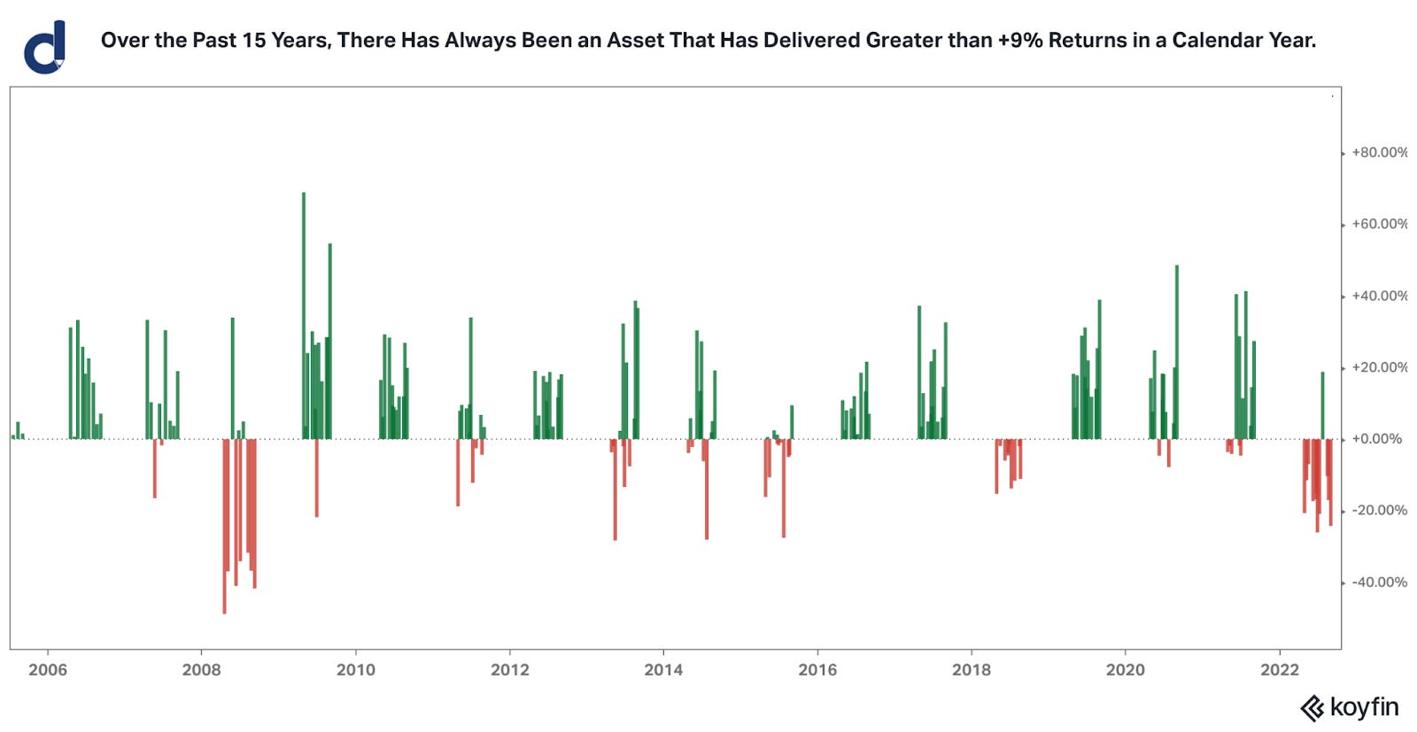
Key Insights:
The key insight from this chart is that over the past 15 years, there has always been an asset that has delivered greater than +9% returns in a calendar year, thereby highlighting the opening line, “there’s a bull market somewhere”.
Notably, the performance of these assets can change from year to year, and endurance (repeatability & persistence) of prior returns in the future is not guaranteed.
Specialization has benefits in becoming highly knowledgeable with expertise in a particular topic or industry. In contrast, successful global macro investors have the ability to “see the big picture” and make investments across a wide variety of asset classes instead of being solely focused on a specific investment silo.
The above chart was created via Koyfin by using the following sample list of index funds to represent a series of corresponding asset classes:

Summary
Today’s newsletter highlighted a series of charts and notable insights regarding historical performance dispersion across sectors and index funds, along with supporting commentary regarding macro investing, synchronous returns vs. dispersion in returns, and utilizing the concept of dispersion in an investment process.
Thank you for reading today’s newsletter from Drawing Capital! We hope the content and analysis in these newsletters continue to be helpful in delivering value to your educational knowledge and investment journey.
As always, we welcome your feedback and opinions. To receive more frequent, premium-tier research, you are welcome to subscribe below. Special thanks to all subscribers, supporters, and readers of Drawing Capital’s newsletter.

References:
Koyfin, https://www.koyfin.com/home
This letter is not an offer to sell securities of any investment fund or a solicitation of offers to buy any such securities. An investment in any strategy, including the strategy described herein, involves a high degree of risk. Past performance of these strategies is not necessarily indicative of future results. There is the possibility of loss and all investment involves risk including the loss of principal.
Any projections, forecasts and estimates contained in this document are necessarily speculative in nature and are based upon certain assumptions. In addition, matters they describe are subject to known (and unknown) risks, uncertainties and other unpredictable factors, many of which are beyond Drawing Capital’s control. No representations or warranties are made as to the accuracy of such forward-looking statements. It can be expected that some or all of such forward-looking assumptions will not materialize or will vary significantly from actual results. Drawing Capital has no obligation to update, modify or amend this letter or to otherwise notify a reader thereof in the event that any matter stated herein, or any opinion, projection, forecast or estimate set forth herein, changes or subsequently becomes inaccurate.
This letter may not be reproduced in whole or in part without the express consent of Drawing Capital Group, LLC (“Drawing Capital”). The information in this letter was prepared by Drawing Capital and is believed by the Drawing Capital to be reliable and has been obtained from sources believed to be reliable. Drawing Capital makes no representation as to the accuracy or completeness of such information. Opinions, estimates and projections in this letter constitute the current judgment of Drawing Capital and are subject to change without notice.